
The moment I saw the paper cut-out animation on today's (May 08) Google doodle, I knew it was a tribute to the great American graphic designer and filmmaker Saul Bass (1920-1996). Today happens to be his birthday, he should be 93 years old by now.

Saul Bass is best known for his movie title sequences, film posters and corporate logos. Being a frustrated graphic designer and filmmaker made me know him before actually. I was just browsing from different popular designers and I happen to stumble upon some of his works.
I like how he was known for notable movie title sequences and probably even setting a benchmark after he died. I really love his paper cut-out animations, simple yet playful, 2d animations for the win! Some of the best movie title sequences that he made, and I also personally like, are "Anatomy Of A Murderer", "Vertigo" (the part where the camera zooms in to the eye still freaks me out), "Ocean's Eleven" (the way it was done at that time, where softwares for animation's still limited, is so impressing!), "Casino" (i think this is the last one he made, he used different Vegas lights and played with it, brilliant!), and the best for me is "It's A Mad Mad Mad Mad World" (the transformation of the globe still amuses me).
- The Google doodle's inspired by his title sequence for the movies (in order): Psycho, The man with the golden arm, Spartacus, West side story, Vertigo, North to northwest, Anatomy of a murderer, Ocean's eleven, Around the world in 80 days.
I do agree that 'best movie title sequence' should be included in the Oscars category, because some movie title sequences are better than the movies!
Saul Bass also made a name for his numerous logos and movie posters. Some of the logos he designed are for: AT&T, Bell Telephone, Hanna- Barbera, the old Quaker, Warner Communications, and many more.

I love Saul Bass' minimalist approach on his movie posters, minimal designs still impress me as I am yet to really understand when too much is too much. That retro / vintage vibe, minimalist, use of primary colors, the jagged hand, paper cut-out typography, all of these reminds us of Saul Bass.

Because his movie poster designs (and his style primarily) made a mark already, a tumblr page was even made featuring films and tv shows' posters derived from Saul Bass' designs.
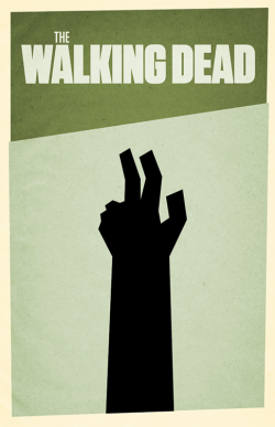

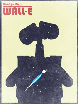
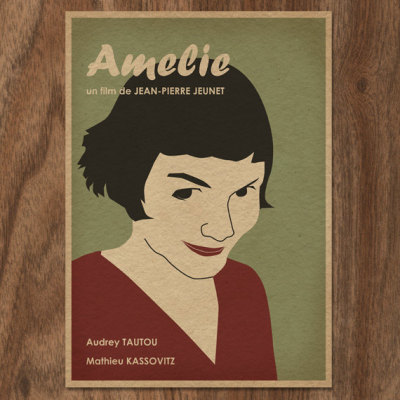
All of these photos are from the said tumblr page: enoughwithsaulbassalready.tumblr.com, the url's funny right? Haha! And yup, the owner did use the Saul Bass inspired "Vertigo theme" for tumblr!
Thanks Saul Bass for leaving a great inspiration to many of our graphic designers, animators, and filmmakers. Yes again, PLEASE, do include 'best movie title sequence' on award giving bodies for film. It is really one of those I look forward to in a movie (next to the soundtrack), hello James Bond films!
High five to your jagged hand Saul Bass and happy happy birthday!
 |
| DESIGN IS THINKING MADE VISUAL - Saul Bass |

No comments:
Post a Comment